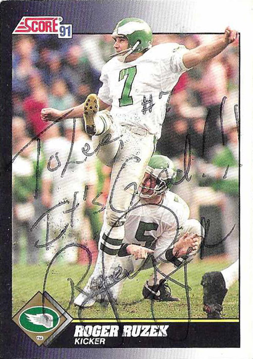
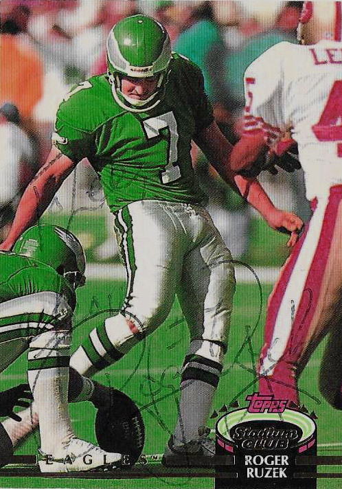
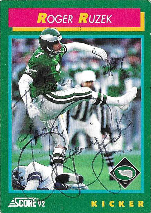
CARDS: Topps 1992, Topps 1991, Topps Stadium Club 1992 ACQUIRED: TTM 2022, C/o Home SENT: 8/22 RECEIVED: 8/27 (5 days)
CAREER SNAPSHOT:
Roger Ruzek played K at tiny Weber State (’79-’82), where he set NCAA Division I-AA records for field goal accuracy (84.2), and school career records in FG (46), FG in a game (4), and consecutive XP (30).
Unable to beat out Matt Bahr in Cleveland as an UDFA in 1983, Ruzek joined the New Jersey Generals in 1984.
He played 2 seasons for the franchise before the league folded.
In ’86 he got a tryout with the Cowboys but didn’t latch onto the team until the following season after a few bumps.
Ruzek ended up posting 22 of 25 on FGs, scoring 92 points.
Tied NFL record with 4 FG in 1 quarter against the New York Giants that year.
Set franchise mark with 5 FGs made against the Rams that year.
In ’88 had a contract holdout, but had a rough year- and was eventually cut during the ’89 season in favor of Luis Zendejas.
Quickly found a home with the rival Eagles that year, and returned to solid form.
The Eagles opted to keep Ruzek and he’d kick with the team through 1993.
During the ’93 season, the Eagles signed Matt Bahr after Ruzek strained a hamstring.
Ruzek again replaced Bahr, later in that season, and then again was released in ’94 as the Eagles opted to go with Eddie Murray.
With a cup of coffee out of the way with the ‘9ers in ’94, Ruzek played Arena ball with the San Jose Sabrecats in 1995.
He then hopped over to London to play in his final season for the Monarchs of the World League in 1996- making 8 of 11 FGs.
NOTES:
Back when I was a kid, I played a lot of soccer. When I started watching football I was all about the kicker. I was surprised, the guy who scored the most points, who had the most pressure on them to win games, didn’t get more love. On the Cowboys, (since that’s all we got here,) I really liked Ruzek, and was surprised the team didn’t stick by him longer during his later struggles with the team. He also made an appearance on the original Tecmo Bowl as a member of the Dallas ‘Wings’.
I had no clue that Ruzek had played for the World League. If I had known that I would have written him sooner. It’s just too bad all he had to sign with was a ball point pen. Regardless he was the shortest wait of 2022 coming in at a breakneck 5 days.
Briefly was on the off-season roster of the Browns that year.
Joined the Arena Football League in 1993, playing for the Thunderbolts through ’94, when the team folded.
Played for the Tampa Bay Storm from 95-98′.
Traded to the Iowa Barnstormers in ’98.
Played one final season in the Arena leagues for the Orlando Predators in 1999.
ACCOLADES:
1996 Arena Defensive Lineman of the Year
Arena Football League All-Star 1993
All-Arena 1995-’96
NOTES:
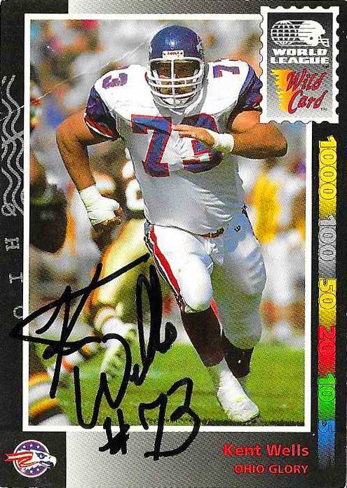
After I saw Kent’s autograph pop up on EBay, I started researching his address and was pretty confident I found a circumstantial fit near Omaha. I shot this request out shortly after and waited, and albeit a bit later than I figured, I got a hit. For only having one card, Kent Wells’ Wild Card World League card is an absolute winner.
TAC
SAC
FUM
INT
YDS
AVG
TD
LG
N/a
3.0
0
0
0
-.-
0
-.-
WL
TAC
SAC
FUM
INT
YDS
AVG
TD
LG
66
13.0
1
0
0
-.-
0
-.-
ARENA
Celebrating the game, the players, the cards, and the autographs for over 25 years.